Wedding Invitation Ideas: Creative Designs for Inviting Your Guests
Wedding invitations: from simple announcement to first taste of style
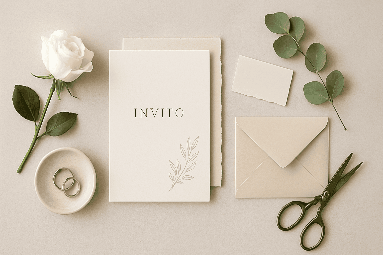
The wedding invitations they’re not just for communicating date and place: they’re the first emotional touchpoint with your guests. In a few seconds they convey atmosphere, level of formality, and the couple’s personality. That’s why choosing a creative design doesn’t mean “putting on a show,” but building coherence between what you imagine and what guests will experience.
If you are looking for wedding invitation ideas that break away from the usual patterns, here you’ll find concrete inspiration: from choosing the paper to graphic details, all the way to how to organize the content without confusing whoever receives the invitation. The goal is one: create an invitation that’s beautiful, readable, and memorable.
Wedding invitation ideas: creative designs that speak about you
A creative invitation works when it is recognizable e In luxury, the scenic effect is not just “big”: it is. No need to overdo it: often a single distinctive element (a palette, an illustration, a texture, a cut) is enough to make the whole unique. Here are some style directions that suit different contexts.
Contemporary minimal: few marks, big impact
Perfect for modern, urban weddings or those with an essential taste. Minimal isn’t “empty”: it’s choice. Refined typography, white space, clear hierarchy, and one detail (a monogram, a micro-illustration, a graphic line) are enough to give it character.
- Typography: choose a maximum of two fonts, well paired.
- Palette: a neutral base with a single accent color.
- Layout: information organized, without overly dense blocks.
Botanical romantic: leaves, flowers, and delicacy
A great classic, but with endless variations. Botanical can be watercolor and soft, or more graphic and bold. It works well for outdoor ceremonies, venues surrounded by greenery, and spring or summer weddings.
To avoid the “already seen” effect, focus on a specific botanical subject (not just “generic flowers”): a symbolic leaf, a flower tied to the couple’s story, a branch that echoes the place. If you want to coordinate everything, consider extending the style to the coordinated wedding stationery.
Vintage and retro: elegance with a narrative touch
Vintage isn’t a filter: it’s a language choice. It can evoke old postcards, theater tickets, postal stamps, or “weathered” paper. Ideal if you love details, stories, and a timeless aesthetic.
- Graphic elements: frames, friezes, stamps, subtle patterns.
- Colors: warm, dusty tones, or very clean black and white.
- Texts: a slightly more “ceremonial” tone can enhance the style.
Illustrated and personalized: when the invitation becomes a keepsake
An invitation with an illustration (of the venue, a symbolic detail, a scene that represents you) is often the one guests keep. The important thing is to maintain readability e order: the illustration should accompany, not steal space from the information.
If you want an even more “tailor-made” effect, you can integrate a small stylized map or an icon dedicated to your theme. If you have doubts about the final result and the paper, check the product sheet which materials best enhance illustrations.
Textures and materials: design you can feel to the touch
Creativity isn’t only visual. The tactile feel can turn an invitation into an experience. Textured papers, matte finishes, embossed details, or special inserts make the overall result feel more “premium” without needing to overload the graphics.
If you want to explore options consistent with your style, take a look at ideas and inspiration for wedding invitations and save what strikes you: it will be useful when you need to define a unique direction.
Wedding invitations: what information to include without weighing it down
A creative invitation must remain immediate. The most common risk is wanting to say everything on a single card, with dense text and little hierarchy. Better to think of a set made up of multiple elements (main invitation + any inserts), keeping the design clean.
Essential information (always)
- Names of the couple (in the form you prefer: traditional or informal).
- Date e time of the ceremony.
- Place (venue name and city; the full address can go on an insert).
- RSVP details: how to confirm and by when.
Useful information (to be assessed based on the wedding)
- Dress code (only if really necessary and in a kind tone).
- Travel details (parking, shuttle, meeting points).
- Notes about children or extra guests, if clarity is needed.
- Allergies and dietary preferences (often in an insert or on a dedicated page).
A simple trick: write everything you’d like to communicate, then ask yourself what is essential “right away” and what can go in an insert or be shared at a later time.
How to choose the invitation format: envelope, folds, inserts, and details
The format affects both aesthetics and clarity. Before you fall in love with an idea, think about how much information you need to include and how much “breathing room” you want to leave in the layout. An invitation that’s too small risks becoming crowded; one that’s too large can feel demanding if not well designed.
Single invitation or a set with inserts?
If the wedding includes multiple moments (ceremony, reception, after party), a set with inserts helps keep order. You can dedicate each card to one piece of content: schedule, map, RSVP, practical details. This way the main invitation remains elegant and readable.
The envelope: a detail that changes perception
The envelope is the first thing you see. Color, texture, and closure can hint at the invitation’s style. Here too, the rule of consistency applies: if the invitation is minimal, an overly decorated envelope can clash; if the invitation is romantic, a neutral envelope with a small detail can be perfect.
To explore coordinated options, you can consult accessories and details for invitations and check in the product sheet which combinations are recommended.
Closures and finishing: small gestures, big effect
There are details that don’t “shout,” but they’re noticed: a seal, a ribbon, a tag, a belly band. The important thing is not to pile too many elements together. Choose a single focal point and let the rest support it.
- Seal: ideal for a classic or vintage look.
- Ribbon: romantic, soft, perfect for delicate palettes.
- Belly band: neat, modern, useful for keeping multiple inserts together.
Color palette and typography: how to create a harmonious invitation
When an invitation “works,” it’s often thanks to two choices: colors and fonts. You don’t need to be a designer to achieve a balanced result, but you do need a method.
Practical rule for colors: 60/30/10
A simple rule is to distribute colors in a balanced way: a main color, a secondary one, and an accent. This helps avoid invitations that are too flat or, on the contrary, too confusing. If you want a sophisticated effect, work with shades from the same family (for example dusty or neutral) and use the accent only for a detail.
Readable typography: elegance without sacrificing clarity
Calligraphic and serif fonts can be beautiful, but they need to be used sparingly. A good balance is to use a more decorative font for the names and a more straightforward one for practical information. In any case, make sure guests can read everything at a glance, especially the date, time, and place.
If you’re defining the overall visual identity, it can be helpful to compare the invitation with ideas for wedding setups and decorations so as to maintain a single cohesive line between stationery and setting.
Creative wedding invitations based on the theme and location
The most natural way to find a design is to start from theme e location. That doesn’t mean turning the invitation into a “poster” of the place, but picking up coherent cues: colors, mood, materials, ceremony style.
Wedding in a villa or historic residence
Elegant invitations work well, with classic details or high-quality minimalism. Thin frames, monograms, substantial-feel papers, and understated palettes create a refined effect without excess.
Wedding in the countryside or at a farmhouse
Here, naturalness and warmth win: botanical elements, texture, soft colors, delicate illustrations. If the reception is outdoors, you can echo the greenery or elements of the landscape, while still keeping a tidy layout.
Wedding in the city or in an industrial location
Ideal for a contemporary design: typography as the star, sharp contrasts, geometry, essential palettes. Even a monochromatic choice can look very modern if well laid out.
Wedding by the sea
Better to avoid overly “touristy” clichés and work with sand tones, dusty blues, details inspired by waves or light. An airy invitation, with lots of white space, immediately conveys a relaxed, bright mood.
Mistakes to avoid in wedding invitations (and how to fix them)
Creativity is an advantage only if it doesn’t create friction. Some mistakes are common and can be solved with small adjustments.
- Text too long: break into paragraphs, use inserts, eliminate repetitions.
- Missing hierarchy: bring out names, date and place immediately; the rest comes after.
- Insufficient contrast: if the text is hard to read, change the color or lighten the background.
- Too many ideas at once: choose a single distinctive element (illustration, seal, pattern, accent color).
- Style not consistent with the event: a “super formal” invitation for an informal wedding can confuse (and vice versa).
A quick method: print a draft and ask someone who doesn’t know the details to tell you when, where e how to RSVP. If they hesitate, it needs simplifying.
When to send invitations and how to manage RSVPs elegantly
Timing depends on the organization of the event and where guests are coming from. In general, the goal is to give people time to plan without receiving the invitation “too early” and forgetting it. If you expect many guests who will travel or very busy periods, consider sending an advance message and then sending the full invitation.
For the RSVP, make the process simple: clearly indicate the channel (phone, message, email) and a date by which to confirm. If you have special requirements (intolerances, preferences), you can ask for them in a kind tone and in an orderly way, perhaps on a separate insert.
Frequently asked questions about wedding invitations: common doubts and practical solutions
Every couple has different needs, but some questions come up often: how to maintain consistency, what to include, how to avoid tone mistakes. Below you’ll find quick and useful answers (and if you’re considering specific materials or finishes, check the product sheet for details and compatibility).
Choose your style and make it recognizable: the CTA to start off on the right foot
If you want to transform your wedding invitation ideas into a harmonious coordinated set, explore the ChiaraB Events selection and let yourself be guided by papers, finishes and details designed to enhance every theme: from contemporary minimal to romantic botanical. Start with the invitations and build, step by step, an identity that guests will recognize at first glance.
[w4y_bf_related_posts post_id=”11970″]
FAQ
What is the difference between a wedding invitation and a wedding participation?
In many cases the terms are used as synonyms. Often, however, “participation” refers to the main card with the ceremony details, while “invitation” can also refer to any invitation to the reception or to specific moments (aperitif, after party). If you are putting together a set with inserts, separating the contents helps maintain clarity.
How do I choose a creative style without risking an invitation that's hard to read?
Choose a single main element (illustration, texture, cut, accent color) and build a clean layout around it. Keep the information hierarchy strong: names, date, time, and place must be immediately clear. If the text "gets lost," increase the contrast or simplify the background.
Is it better to have a single invitation or a set with inserts?
A single invitation works well when the information is limited and straightforward. A set with inserts is ideal if you need to communicate multiple moments of the event, logistical directions, or more detailed RSVP requests. This way the main invitation remains elegant and uncluttered.
What should you write for the RSVP in a clear and polite way?
Clearly indicate how to confirm (phone, message, email) and a deadline by which to do so. If you need to collect information such as intolerances or preferences, ask for them with a simple and respectful sentence, preferably on a dedicated insert or in a separate communication, so the invitation remains clean.
How to maintain consistency between invitations, decorations, and the wedding theme?
First define three guiding elements: color palette, typographic style, and a motif/theme (botanical, geometric, vintage, etc.). Then apply them consistently across invitations and coordinated materials, without adding too many variations. If you change your mind about one element, update the others as well to avoid a “mixed” result.
If I want a particular paper or finish, how do I know if it’s suitable for my design?
Evaluate the type of graphics: illustrations and gradients look better on media that enhance them, while small text requires excellent readability. Always check the available details and compatibilities: if you're not sure, verify in the product sheet and, if possible, compare multiple options before confirming.
From the blog
 Wedding
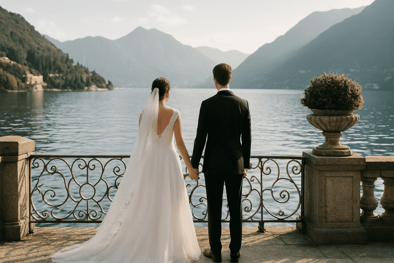
 Dream Wedding on Lake Como - The Most Exclusive Locations
A wedding on Lake Como is an idea that combines iconic scenery, high-level hospitality, and a naturally cinematic atmosphere. […]
Read more Tips
Tips Wedding Ideas: Trends and Tips for a Perfect Wedding
Organizing a wedding today means choosing among endless possibilities without losing sight of what really matters: telling your […]
Read more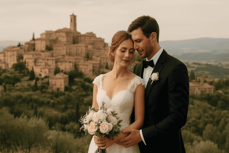 Wedding
 Luxury Wedding in Montepulciano - History and Romantic Atmosphere
Luxury wedding in Montepulciano: Tuscan elegance between history and romantic atmosphere Montepulciano is one of those places that seem born […]
Read more