

Matching ceremony dresses and fittings - the ChiaraB Events touch of style
Ceremony outfits and coordinated setups: when style becomes a common thread
There are events you remember for a phrase, a smile, a piece of music. And then there are those that stay etched in your mind for visual harmony: colors that converse, consistent materials, details that seem “born together”. In this balance, ceremony outfits and coordinated setups are not two separate worlds: they are the same story told in different languages.
ChiaraB Events’ touch of style starts right here: helping you build an overall image in which outfit and scenography support each other, without excesses and without rigidity. To start finding your way, you can explore the selection of ceremony outfits and, in parallel, take a look at ideas and inspirations for setups.
“Coordinated” is not uniformity: it’s coherence among palette, textures, and atmosphere
Coordinating doesn’t mean repeating the same color everywhere or imposing a rigid theme. It means choosing an aesthetic direction and keeping it recognizable in every element: from the fabric of the outfit to the candlelight, from the bouquet to the ribbons, all the way to the table setting.
Good coordination comes from three main levers:
- Color palette: 2–3 guiding shades, plus supporting neutrals (check the product sheet for available color variants).
- Textures and materials: satin, tulle, linen, glass, metal… material creates atmosphere even more than color.
- Event style: romantic, modern, minimal, garden, classic… each style has implicit “rules” of proportions and details.
If you want a quick starting point, it can be helpful to consult a guide to palettes for ceremonies and then come back to the outfit with a more informed choice.
How to choose a ceremony outfit while already thinking about the setup
Often you choose the outfit first and only afterward think about the rest. It works, but it can create dissonance: a super bright outfit in a very rustic, highly textured setting, or a minimal dress in a baroque scenography. The most effective method is to make a “paired” choice: outfit + setting.
1) Start with the location and the light
The same shade changes drastically between natural light, warm evening lights, and indoor environments. If the event is in a greenhouse, in a garden, or in a hall with scenic lighting, consider how the colors look in real life. For some items, finishes and reflections may vary: check the product page.
2) Define your role in the event
Guest, witness, bridesmaid, mother of the bride, anniversary celebrant: each role has its own level of aesthetic “presence”. Coordinating with the setup doesn’t mean blending into the background, but finding the right point between standing out e consistency.
3) Choose a bridging detail
When you want to avoid the “matchy-matchy” effect, focus on a single element that acts as a bridge between outfit and scenery:
- a color echo in the accessories (clutch, scarf, earrings);
- a flower or ribbon consistent with the palette;
- a similar texture (for example matte on matte, glossy on glossy);
- a metallic detail (gold, silver, champagne) echoed in candelabras or place cards.
Palettes and pairings: practical ideas for coordinated dresses and setups
There is no absolutely “right” combination, but some palettes are particularly versatile and easy to make elegant. Here you’ll find ideas you can adapt to your taste and the context (and, for availability and variations, check the product page).
Blush and nude tones: contemporary romanticism
Perfect for daytime ceremonies and bright settings, blush tones work well with light setups: airy flowers, soft fabrics, sheer elements. The outfit can stay delicate, while the setup can add depth with warm neutrals and small metallic accents.
Dusty blue and soft light blues: calm elegance
A palette that conveys order and refinement. In the setup, it lends itself to clear glass, candles, and off-white details. On the dress, dusty blue is often a choice that enhances without “stealing the show”.
Sage green and botanical: natural but polished
Sage green is a valuable ally when you want a garden-chic effect. It works with natural materials and with floral arrangements that look spontaneous but are carefully designed. The dress can echo the tone or remain neutral, leaving the bouquet to recall the palette.
Champagne and soft gold: light and formality
For evening events or more formal contexts, champagne and soft gold create an elegant impact without feeling excessive. The winning idea is to balance: if the dress is luminous, the setup can become more essential; if the scenery is rich in reflections, the outfit can choose clean lines.
Coordinated setups: the details that make an “event” without weighing it down
A well-coordinated setup doesn’t have to be heavy. It has to be intentional. And often it’s the details that make the difference, because they guide the eye and build a visual rhythm.
Here are some elements that, if chosen consistently, transform the whole:
- Textiles: runner, napkins, bows, draping. Even a single well-chosen fabric can “tie” everything together.
- Centrepiece: more than height, what matters is the shape and harmonious repetition along the tables.
- Place cards and stationery: paper, fonts and colors can subtly echo the dress.
- Lighting: warm or cool lights change the perception of colors and materials.
- Backdrops and photo corners: they are the point where outfit and setup meet “on camera”.
If you’re interested in creating a coherent story in the shots too, it can be helpful to consult tips for a coordinated photo corner and then review the outfit through the same lens.
Coordinating without stress: a simple 5-step method
When you have a thousand decisions to make, the risk is losing the big picture. A practical method helps you choose with more confidence and avoid second thoughts.
- Choose the atmosphere: romantic, modern, natural, classic. One guiding word.
- Define the palette: two main colors + a neutral. If you want, a metallic accent.
- Select the dress based on light, season and role (check sizes and variants in the product sheet).
- Align 3 key elements of the setup: textiles, flowers, lights. You don’t need to coordinate everything.
- Do a visual test: gather photos/textures in a mini moodboard and check that it “sounds” right.
To complete the vision, you can also explore accessories and details for ceremonies which are often the simplest bridge between outfit and scenery.
The ChiaraB Events style touch: harmony, personality, and attention to the scene
Style isn’t just aesthetics: it’s a language choice. The ChiaraB Events touch is recognizable when every element seems in the right place, yet nothing feels forced. The goal is to create a coordinated look that respects your personality and the event’s identity.
In practice, this means:
- Balance between standing out and discretion: the outfit enhances, the setup supports.
- Consistency between materials and colors: even with just a few elements, the overall result feels “thought out”.
- Attention to detail: finishes, ribbons, lights, and small echoes that elevate the atmosphere.
If you’re building an event with a precise aesthetic, it can also help to read ideas for an elegant and coordinated theme, so you can turn an intuition into a clear direction.
Frequently asked questions about formalwear and coordinated setups
Below you’ll find some quick answers to the most common doubts, useful when you want to coordinate outfit and scenery without making your life complicated.
Want a coordinated look that stands out, but with elegance? Explore the ChiaraB Events category and brand: between formalwear and details for coordinated setups, you can build a cohesive, personal whole that’s ready to be remembered.
[w4y_bf_related_posts post_id=”33383″]
FAQ
How do I coordinate my formal outfit with the setup without looking "too matchy"?
Choose just one bridging element: an accessory, a texture, or a metallic accent that echoes the setup’s palette. Avoid replicating the same color everywhere and instead aim for overall coherence.
Is it better to choose the outfit first or the event's color palette first?
If you can, first define the mood and palette (even in a simple way: two colors + a neutral). Then choose the outfit based on light, season, and your role in the event. This way, outfit and setting will be more harmonious.
Which styling details most influence how the outfit looks in photos?
Lighting, the backdrop/photo angle, and textiles (runner, napkins, draping) greatly affect the perception of color and materials. If you have doubts about finishes or variants, check the product page.
Can I use a neutral palette and add just one accent color?
Yes, it’s an elegant and easy-to-manage solution. Keep the outfit or setup neutral and add an accent (for example in the flowers or accessories) to give character without weighing it down.
How do I choose the right materials for an elegant coordinated outfit?
Aim for materials that are consistent with each other: matte with matte for a soft effect, glossy with glossy for a more dramatic look. If you mix, do it intentionally (for example, a single shiny element). For availability and finishes, check the product page.
From the blog
 Wedding
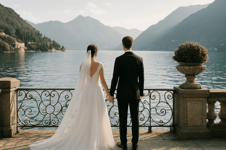
 Dream Wedding on Lake Como - The Most Exclusive Locations
A wedding on Lake Como is an idea that combines iconic scenery, high-level hospitality, and a naturally cinematic atmosphere. […]
Read more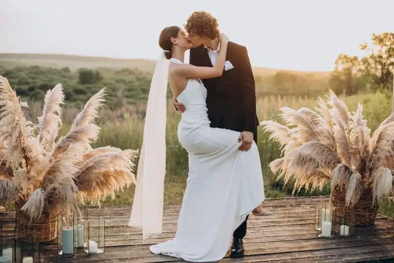 Tips
Tips Wedding Ideas: Trends and Tips for a Perfect Wedding
Organizing a wedding today means choosing among endless possibilities without losing sight of what really matters: telling your […]
Read more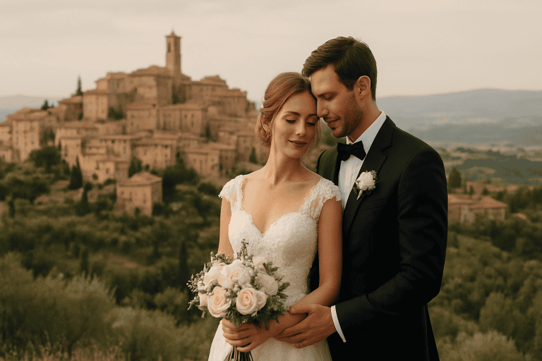 Wedding
 Luxury Wedding in Montepulciano - History and Romantic Atmosphere
Luxury wedding in Montepulciano: Tuscan elegance between history and romantic atmosphere Montepulciano is one of those places that seem born […]
Read more