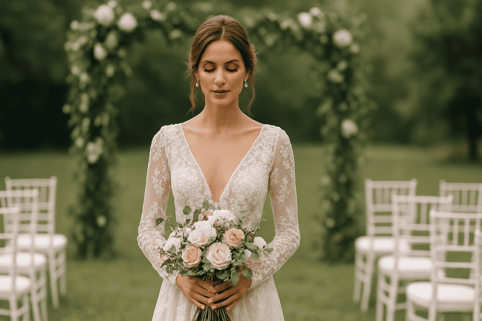
Trendy creations for unique weddings with ChiaraB Events
A unique wedding isn’t born from a “theme” chosen at the table, but from a series of coherent details that tell who you are. The trendy creations don’t serve to chase fashion: they help shape a contemporary, personal, and memorable atmosphere. With ChiaraB Events, the idea is to transform inspirations, palettes, and materials into a fluid aesthetic journey: from the ceremony to the reception, all the way to the smallest moments (and often the most photographed).
In this article you’ll find concrete ideas to interpret trends authentically: decorations, graphic suites, table styling, accessories and color choices. Without lists of specific products: proposals can change over time, so whenever you want to explore a detail further check the product sheet.
On-trend creations for unique weddings: how to choose without conforming
The strongest trend today is smart personalization: not “everything personalized,” but the right elements at the key points of the experience. To avoid the copy-and-paste effect, work on three levels:
- Identity: which words describe your style? (romantic, minimal, Mediterranean, urban, retro…)
- Consistency: colors, materials, and shapes must speak the same language in every area.
- Rhythm: alternate statement moments with understated details, so the whole can breathe.
A good method is to start with an essential palette and then add an “accent”: an unexpected color, a particular finish, a texture (velvet, linen, textured paper, brushed metal). The result is contemporary, but not loud.
On-trend palettes and materials for wedding decorations
The most current palettes aren’t necessarily neutral: they often play on soft contrasts and on materials that catch the light. Some directions that work well in different venues:
- Warm neutrals (ivory, sand, biscuit) with delicate metallic accents.
- Dusty tones (blush pink, sage, powder blue) for contemporary romanticism.
- Rich colors (burgundy, deep blue, forest green) in small touches, for a sophisticated effect.
- Black and white with artisanal details: clean graphics, but rich textures.
In parallel, attention to finishes is growing: textured paper, fabric ribbons, embossed details, light transparencies. If you’re considering a specific material (for example a particular paper or a finish), check the product sheet the yield and the available options.
Texture and details: the “luxury” you notice without overdoing it
Contemporary luxury is often quiet: you sense it in the details. A well-chosen place card, a ribbon with a pleasant hand feel, a print with a tactile finish can elevate the entire setup without weighing it down. The goal is for every element to be beautiful up close and coherent from afar.
Wedding stationery suite: invitations, menus and place cards in ChiaraB Events style
The stationery suite is the first promise you make to your guests: it anticipates the atmosphere and builds anticipation. Current trends favor clean typography, airy compositions and a mindful use of color. There’s no need to fill: you need to guide the eye.
To maintain coherence, think of the suite as a system:
- Invitation: defines style and tone (formal, informal, creative).
- Welcome: welcomes and guides, with immediate impact.
- Table styling: menus, place cards, seating chart and table numbers speak to each other.
- Details: tags, labels, small signs and messages complete the experience.
If you want to explore inspirations and coordinated solutions, you can start with wedding stationery ideas and then build the rest in a modular way, choosing only what you really need.
Typography and illustrations: minimal, botanical or artistic?
Among the most requested choices are light botanical graphics, essential editorial-style lines, and illustrations with an artistic stroke. The difference is made by balance: a strong decorative element (for example an illustration) calls for cleaner text; a bold typography can stand on its own, without frames or frills.
Table setup and table styling: centerpieces, place cards and scenic details
The table is where guests spend the most time: this is where attention to detail becomes an experience. On-trend creations focus on light compositions, varied heights and micro-details that make each place setting “thoughtful”.
For contemporary table styling, consider these elements:
- Layering: table linen, runner or contrasting textures.
- Visual rhythm: alternate full and empty elements, avoiding the “all the same” effect.
- Place cards: small, but decisive for the perception of care.
- Menu: readable and beautiful, integrated into the palette.
To learn more about how to harmonize the details on the table, take a look at wedding table styling inspirations. If instead you’re looking for a specific idea for the place setting, you can explore solutions for place cards and table details.
Centerpieces: the trend is to “air them out”
Today’s most appreciated centerpieces leave room for conversation. The scenic effect doesn’t depend on size, but on composition: clean lines, well-distributed volumes, luminous touches. Even non-floral elements (candles, micro graphic details, small stands) can make the difference, especially if consistent with the rest.
Decorations for ceremony and reception: from the entrance to the cake cutting
A unique wedding is built like a journey. Each area has a role: to welcome, move, guide, surprise. The most interesting trends work on focal points well positioned, without filling every corner.
Here are some areas to work on with targeted creations:
- Entrance: a welcome element that immediately defines the style.
- Ceremony: essential details, but with a scenic focal point (arch, backdrop, arrangement).
- Photo area: a coherent backdrop, not necessarily “huge”, but well cared for.
- Cake cutting: lights and small details that make the moment iconic.
If you want to focus on the welcome, you can start with ideas for welcome and entrance decorations. To create a complete narrative between ceremony and reception, explore inspirations for coordinated decorations.
Lights, ribbons and transparencies: details that change the atmosphere
Warm lights, light transparencies and textile details are “invisible” tools that transform a location. A well-chosen ribbon can tie together bouquet, stationery and mise en place; a transparency can lighten; a light can make everything more intimate. If you’re considering a specific finish or support, check the product sheet the result and the available variants.
Wedding favors and gifts: elegant, useful and customizable trends
The guest favor is a gesture of gratitude: to feel current, it must be well-groomed and consistent with the wedding, not necessarily complex. Trends are moving toward minimal packaging, short messages, and a clean aesthetic.
To make the cadeaux truly “yours,” work on:
- Packaging: materials and colors aligned with the palette.
- Customisation: initials, date, or a phrase that represents you.
- Presentation: how it is displayed and handed to guests.
A detail often underestimated is the consistency between the favor and the table: when the small elements “talk” to each other, the final effect is more professional and photogenic.
How to create a common thread between the wedding’s style, colors, and details
The common thread isn’t a logo repeated everywhere: it’s a feeling. To achieve it, select 2–3 recurring elements and use them consistently. Some examples:
- A typography pairing (headings + body text) to reuse on invitations, menus, and signs.
- An accent color to add in small doses (ribbons, table details, graphics).
- A texture (textured paper, fabric, finish) that returns in multiple places.
If it seems hard to maintain consistency, try a visual test: put together a draft invitation, a menu, and a place card (even just as an idea). If they “look good” next to each other, you’re on the right track.
Ideas for unique weddings: a mix of trends and personality
Trends work when they become a language to tell your story. Some ideas that adapt well to different styles:
- Short, authentic messages: few words, but well chosen, on welcome signs, menus, or tags.
- “Editorial” details: clean layouts, white space, magazine-like look.
- Controlled contrasts: a modern element in a classic setting (or vice versa).
- Micro-personalizations: not everything, but what guests touch and see up close.
The secret is to avoid the “too many ideas” effect: better a few strong choices, repeated consistently, than a collage of disconnected inspirations.
Useful links to organize your wedding style
If you’re building your moodboard and want to move from ideas to details, these paths can help you find your way:
- Inspiration for wedding decorations and details
- Solutions for coordinated graphics and stationery
- Ideas for mise en place and table styling
- In-depth looks at customizable elements
CTA: create your on-trend wedding with ChiaraB Events
If you want a wedding that brings together trend e personality, explore the ChiaraB Events selection and build your style starting from the details that really matter: coordinated sets, decorations, and scenic touches designed to make the whole coherent and unforgettable.
[w4y_bf_related_posts post_id=”33385″]
FAQ
How do I choose trendy creations without risking an "all-the-same" wedding?
Start with 2–3 identity elements (palette, typography, a texture) and repeat them consistently at key points: invitation, welcome, table, and scenic moments. Avoid piling on too many different inspirations: a few strong choices, well distributed, make the whole feel personal.
What are the details that really make a difference in wedding photos?
They usually have a big impact: welcome and entrance signage, the mise en place (menu and place cards), a focal point during the ceremony, and the cake-cutting area. They are elements that define the atmosphere and often appear in photos.
How can I maintain consistency between the graphic identity and decorations?
Use the same palette and a recurring typographic pairing on invitations, menus, and signs; then echo a material detail (ribbon, textured paper, finish) in the table setting as well. If you are considering a specific finish, check the available options in the product sheet.
Is it better to focus on a theme or on a common thread?
Often a common thread works better: it’s more flexible and less “literal”. You can build it with recurring colors, materials, and shapes, without having to turn every element into a quotation of the theme.
What can I customize without making the setup heavier?
Customize what guests see and touch: invitation, place card, menu, small tags, and a welcome message. Avoid customizing everything: the final effect is more elegant and tidy.
From the blog
 Wedding
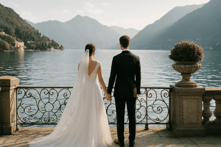
 Dream Wedding on Lake Como - The Most Exclusive Locations
A wedding on Lake Como is an idea that combines iconic scenery, high-level hospitality, and a naturally cinematic atmosphere. […]
Read more Tips
Tips Wedding Ideas: Trends and Tips for a Perfect Wedding
Organizing a wedding today means choosing among endless possibilities without losing sight of what really matters: telling your […]
Read more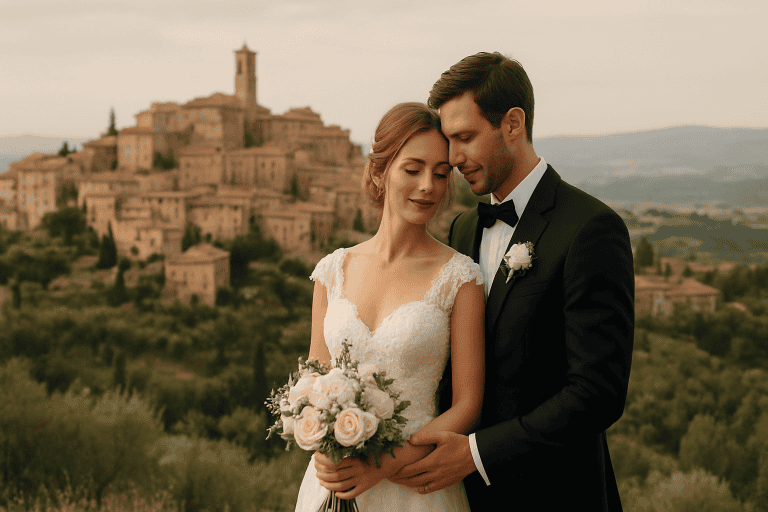 Wedding
 Luxury Wedding in Montepulciano - History and Romantic Atmosphere
Luxury wedding in Montepulciano: Tuscan elegance between history and romantic atmosphere Montepulciano is one of those places that seem born […]
Read more