Luxury experiences between spectacle and design with ChiaraB Events
There are events that simply “work” and others that become luxury experiences: memorable, spectacular, consistent in every detail. When spectacle meets design, the effect is never accidental: it comes from creative direction, from a careful selection of elements, and from a vision capable of turning a space into a story. With ChiaraB Events, the goal is precisely this: to build atmospheres that speak of style, identity, and hospitality, without giving up impact.
In this article you’ll find a practical and inspirational path: how a luxury event is born, which choices really make the difference, and how to integrate set design, lighting, mise en place, and sensory details into a harmonious project. To explore the approach further and discover other ideas, you can start from ChiaraB Events and from the content dedicated to inspirations for events.
Luxury experiences with ChiaraB Events: aesthetics, direction, and identity
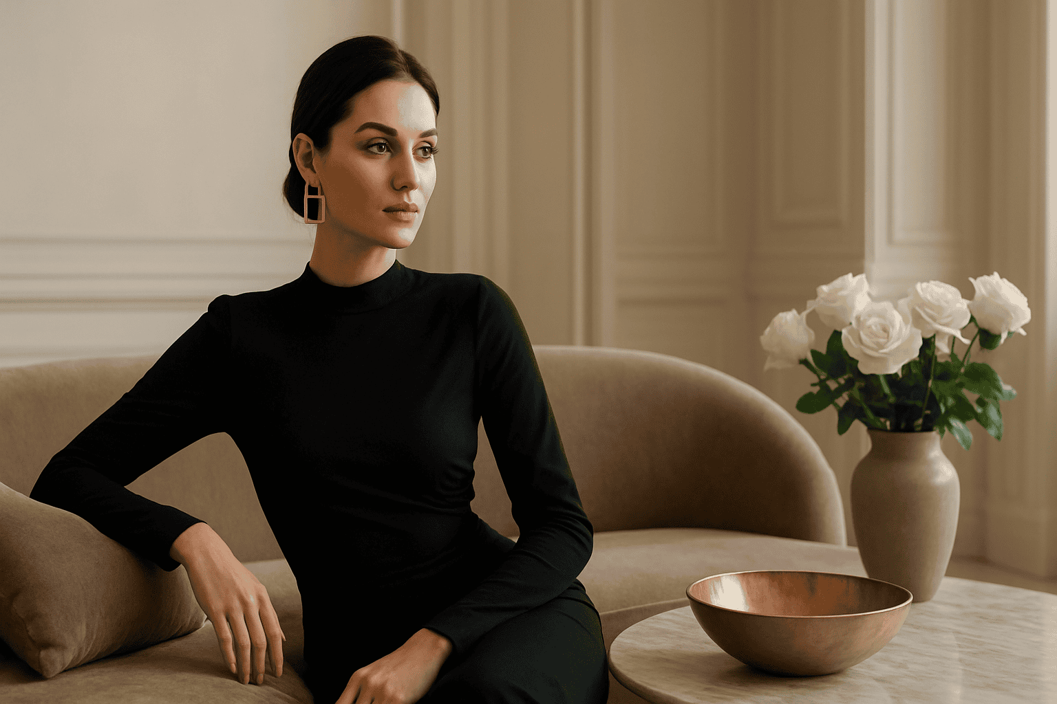
Talking about luxury today means talking about consistency, care e customisation. It’s not enough to add “important” elements: you need a common thread that unites the location, palette, materials, the rhythm of the evening, and guests’ perception. ChiaraB Events works with a creative direction that puts the client’s identity at the center and turns it into a visual and sensory language.
The result is an event that doesn’t look built “in blocks”, but designed as a whole: from the entrance to the table, from the key moment to the conversation areas. If you want to find your way among the different types of projects, it can also be useful to consult the section dedicated to events to understand how the direction changes depending on the occasion.
Event design: how to build an elegant set design
Set design is the first impact, but also the container that supports the entire experience. In a luxury event, set design is not “decoration”: it is temporary architecture. It means thinking in volumes, perspectives, solids and voids, heights, and focal points.
A successful project works on three levels:
- Structure: structural elements (backdrops, wings, entrances, photo areas) that define the space.
- Material: fabrics, surfaces, finishes, and textures that add depth and character.
- Detail: “close-up” touches (place cards, menus, small accents) that complete without weighing it down.
A useful tip: instead of adding, it’s often better to subtract. A single important backdrop, well lit, can be worth more than many scattered decorations. Elegance is felt when every element has a reason to be there.
Color palette and materials: luxury is felt before it’s even seen
The palette is not just an aesthetic choice: it’s an emotional choice. Neutral and warm tones convey welcome and intimacy, while sharp contrasts and deep colors create theatricality. The key step is to avoid the “catalog” effect: better a reduced palette, with targeted accents.
For materials, the idea is to alternate matte and reflective surfaces, soft and structured. Luxury emerges when the combination is intentional: a fabric with a substantial hand, a metal with a consistent finish, a texture that returns in multiple points (without repeating monotonously).
Tailored spectacle: scenic moments without excess
Spectacle does not coincide with excess. In a high-end event, the “wow” is often a matter of timing e direction: a lighting change, a planned entrance, a reveal of a set-up area, a central moment that becomes the most shared memory.
To achieve an elegant scenic effect, it works to set a hierarchy:
- One leading moment (the emotional peak of the evening).
- Two or three supporting moments (micro-surprises distributed throughout).
- A visual continuity that ties everything together (palette, style, materials, light).
This approach avoids accumulation and makes the experience more “cinematic”: the event flows, builds, and leaves room for conversation and conviviality.
Entrances, backdrops and photo areas: designing impact without blocking flows
A point often underestimated is flow management: a scenic entrance must be beautiful, but also functional. If it creates queues or bottlenecks, the luxury effect is lost. The solution is to design photo areas and backdrops as open “rooms”: recognizable, but set to the side of the main route.
If you are considering scenic elements and accessories, you can take a look at ideas and inspirations for setups (check the product sheet for available variants and recommended pairings).
Luxury mise en place: table, light and details that make the difference
The table is where the guest stops: here the design must hold up even up close. A luxury mise en place is not necessarily complex, but it is precise: proportions, alignments, visual rhythm, alternation of volumes. The goal is to create a harmonious overall impression and, at the same time, a feeling of personal care.
Some elements that greatly affect perception:
- Layering: base, plate, service elements and graphic details in dialogue.
- Consistency of finishes: metals and tones that don’t “clash” with each other.
- Heights: alternate low/medium/high to add dynamism without obstructing the view.
- Negative space: leaving breathing room makes everything more exclusive.
Centerpieces and arrangements: balance between presence and lightness
The centerpiece is often the visual protagonist, but it must respect conversation. A good rule of thumb is to think of arrangements that “accompany” rather than intrude: well-distributed volumes, integrated points of light, elements that echo the palette without replicating it literally.
If you want a more contemporary look, the idea of a modular arrangement works very well: multiple coordinated elements along the table, instead of a single central block. This way you get continuity and can manage the impact based on the space.
Lighting and atmosphere: directing light in luxury events
Light is the “filter” through which everything is perceived: colors, materials, volumes, even skin tones in photos. For this reason, in luxury events lighting is not a technical detail, but a creative choice. A well-thought-out design works on levels of light: ambient, accent, and scenic.
In practice:
- Ambient light for comfort and orientation.
- Accent light to enhance backdrops, tables, textures, and focal points.
- Scenic lighting for key moments (entrances, reveals, cake cutting, toasts).
A common mistake is choosing lighting that is too uniform: it flattens and makes everything look “flat.” Better to build depth, with softer zones and others more highlighted. If you are considering accessories or decorative solutions that interact with light, consult the selection of elements for the atmosphere (check the product sheet for materials and finishes).
Personalized details: luxury as a sensory experience
Luxury is recognizable even when you’re not looking at it directly. A discreet fragrance, a pleasant-to-the-touch texture, consistent graphics, a well-chosen background sound: these are micro-signals that build a memory. Personalization, however, works only if it remains elegant and not intrusive.
Some “high-end” personalization ideas (without turning the event into a showcase):
- Coordinated graphics for menus, place cards, and small labels, with recognizable typography.
- Material details (ribbons, papers, fabrics) chosen in continuity with the palette.
- Small gestures of welcome designed for the context (not necessarily “big”).
- A narrative thread that returns in several places: a motif, a shape, a symbol.
If you want to understand how to set up a customization consistent with the style of the event, it may be helpful to explore ideas for stationery and coordinated details.
Venue and setup: adapting the design to the real space
Every venue has a voice: historic, minimal, industrial, natural. A luxury event doesn’t “cover” the venue; it interprets it. The key is to understand what to enhance and what to tone down, building a setup that feels like it was born there.
To work well with the space, it helps to think about:
- Focal points: where will the eye fall as soon as you walk in?
- Perspectives: which lines and heights are worth emphasizing?
- Functional areas: welcome, social area, tables, special moments.
- Acoustics and comfort: elegance also comes through comfort.
When the space has a strong character, a more essential but “precise” scenography often works. When the space is neutral, the setup can become more architectural and build a strong identity.
Outdoor and indoor: two different directions, same goal
Outdoors, natural light and the environment are already scenography: the project must dialogue with the context and plan for a credible transformation as evening falls. Indoors, on the other hand, control is greater: you can work more intensely on lighting, backdrops, and visual rhythms. In both cases, the goal remains the same: a coherent experience from arrival to farewell.
How a ChiaraB Events project is born: from concept to staging
Behind a luxury event there is a process. It’s not just “choosing beautiful things,” but making them speak to each other. In general, an effective project develops in phases, each with a specific role.
- Listening and brief: desired style, event objectives, mood, guests, context.
- Creative concept: palette, materials, inspirations, main scenic focal points.
- Experience design: flows, timing, key moments, atmosphere.
- Element selection and coordination: setups, details, visual consistency.
- Staging: assembly, finishing touches, final overall check.
The most “invisible” part is often the most important: consistency. When everything is consistent, the guest perceives quality without having to decipher it.
Useful links to inspire you and plan a luxury event
If you’re gathering ideas and want to build a clear vision before defining the details, these paths can help you find your direction:
- Inspiration for luxury events for moodboards, palettes, and styles.
- Staging and scenery to understand how to set up focal points and special areas.
- Coordinated details and personalization to make the experience more recognizable.
For each element you’re interested in, check the product sheet variants, finishes, and recommended pairings: it’s the best way to maintain consistency between the idea and the final result.
Frequently asked questions about luxury events and design with ChiaraB Events
Answers to the most common questions help you clarify how to set up a luxury event, which choices really impact the result, and how to maintain consistency between spectacle and design.
Do you want to turn your next event into a luxury experience between spectacle and design? Explore the ChiaraB Events world and let yourself be guided by a consistent creative vision: visit ChiaraB Events and discover the selection designed to create elegant, scenic, and bespoke atmospheres.
[w4y_bf_related_posts post_id=”33475″]
FAQ
What really makes an event “luxury” beyond the setups?
The perception of luxury comes from overall consistency: a clear concept, harmonious materials and palette, attention to detail up close, and a direction of timing that guides the guest without forcing.
How do you achieve a dramatic effect without being excessive?
It works to choose a hero moment (the main “wow”) and a few supporting moments, maintaining visual continuity given by palette, finishes, and lighting. Subtraction often increases elegance.
Which elements have the greatest impact on luxury table setting?
Balanced layering, consistent finishes, height management, and negative space. Alignment and precision in the details (coordinated graphics, small accents) also make a big difference.
Why is lighting so important in luxury events?
Because it changes the perception of colors, textures, and volumes and also influences photographic rendering. Layered lighting design (ambient, accent, scenic) creates depth and atmosphere.
How do you adapt a design project to a location that already has a strong character?
The strengths of the venue are enhanced and you avoid “covering it up.” Often an essential but precise setup is better, with a few well-designed focal points and a palette that interacts with the surroundings.
How to choose custom details without making the event too “branded”?
Focus on subtle, consistent customizations: coordinated typography and graphics, carefully chosen materials, and a narrative thread that returns in multiple places. Better small signs repeated with elegance than intrusive elements.
From the blog
 Tips
Tips Getting married in Sicily in Summer - Pros and Cons
Getting married in Sicily in summer: what it really means (beyond the dream photos) Choosing to get married in Sicily in summer is not […]
Read more Tips
Tips Sicily for Intimate and Micro-Weddings - Ideas and Tips
An intimate wedding is not a “reduced version” of the big day: it is a different way of experiencing it. In Sicily, the idea […]
Read more Tips
Tips How to Organise a Wedding in Sicily from Another Region
Organizing a wedding in Sicily while living in another region is an exciting project, but it requires method: distance, response times, […]
Read more